Mapping Encampment Fires in Oakland
Sabrina Armaghan Kharrazi
In the 2020 fire season, the city of Oakland saw an extreme increase in the amount of encampment fires that were occuring even just on a daily basis. This data I obtained from the Oakland Public Records Department showed that by in 2020, the amount of encampment fires in Oakland had reached a level of two per day. The fire department only started uniquely documenting and classifying these types of fires in the beginning of 2017, so data collection and analysis is extremely limited.
The first graph I created is a baseline map that plots the location at which each encampment fire occured since 2017. Many of these locations had repeat fires, with the highest one being up to 85 unique incidents. I have also added a gradient purple layer to the base map to demonstrate median income based on zipcode.
My First Tableau Map:
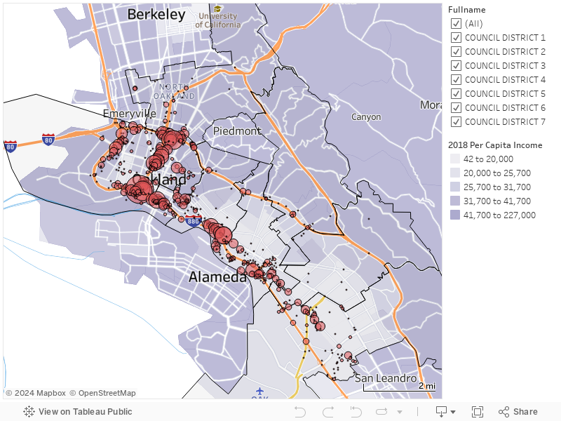
In order to quantify repeat events, the size of the circles at each point designate the cummulative amount of individual events at a location. The map immediately reveals several things. The first is the clear association between encampment fire incidients and the major freeways, which are denotated in orange on the map. This is likely the result of a combination of factors. In many cases, the land immediately surrounding freeways is of a federal or state jurisdiction that sometimes lends itself to less legal intervention from local police.
Beyond this, further contextualizing the information provided by the map by looking at the distribution and frequency of fires across each of the seven city council districts. Oakland displays notoriously stark inequity, and I wanted to create a visual distinction of where each of these districts specifically lie since only their outlines are overlayed on the first map. The districts are color coordinated with the lightest red districts having the least number of cummulative fires since 2017 and the darkest red districts having the most fires.


In order to contextualize the socioeconomic and equity distribution in each of the districts, I mapped the city of Oakland’s neighborhood risk assessment. Unfortunately, the only region specific-enough category of data that the city had collected was by neighborhood. In order to allow this to better relate to districts, this map has the option to select and group specific neighborhoods. This hopefully allows for someone to select the neighborhoods that align with a district and can be compared to the districts in the map above and how those areas are more or less impacted by fires.