Final Project
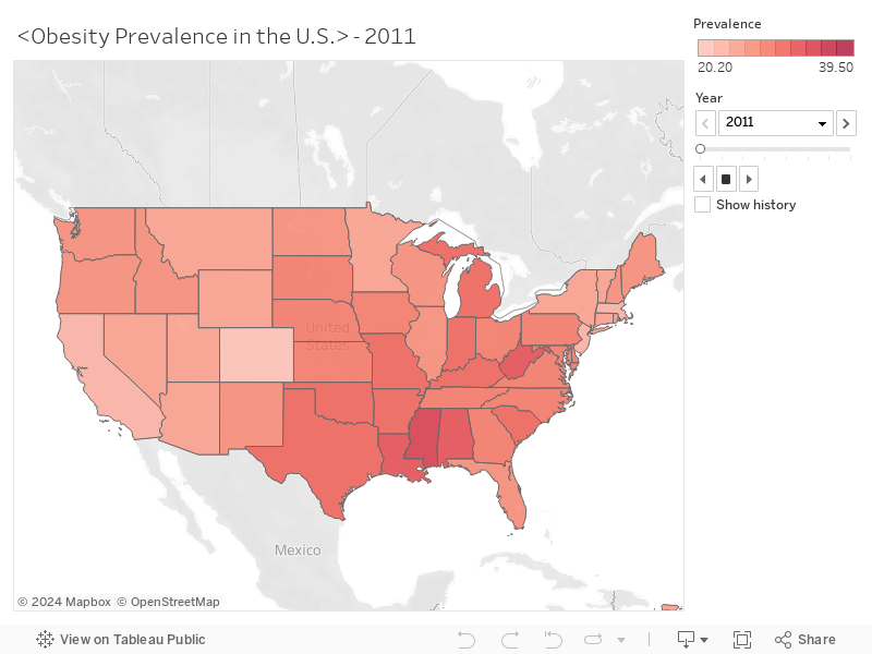
My project mainly concentrates on the obesity issue within the United States from the year of 2011 to 2018. The data was obtained from the website of the Center for Disease Control. And I tried to explore this topic from a chronological as well as geographical perspective. So through the animated map, you can see: how the numbers of obesity incidence changed over time; which states are with high or low prevalence of obesity in this country.
According to this animated map, it can be figured out that from 2011 to 2018, the obesity prevalence in the U.S. tends to increase. As for different regions, in general, the southeastern part has higher prevalence than the northwestern one. It is worth mentioning that Mississippi, has more obesity incidence compared with other states in 2011, and keeps increasing during these few years, as the following graphic shows.
Peiyun Jiang
Email: peiyunjiang@berkeley.edu