Using data and indicators aggregated by the California Office of Environmental Health Hazard Assessment (OEHHA), the map above and the charts below explore where environmental conditions are the worst (and best) in the Bay Area and how class and race relate to those conditions. This first set of charts shows the relationship between poverty and pollution.

In every Bay Area county, as the percentage of people living in poverty increases, the level of total pollution burden increases. Use the dropdown menu to explore the relationship between poverty and pollution in the Bay Area's nine counties.


The relationship between race and pollution is weaker, according to the OEHHA data compilation, but white people are the only racial group in the Bay Area that have a negative correlation between overall pollution burden score and percentage of race. White people in the Bay Area only had a positive correlation between the percent of the total population they made up and drinking water contaminants. Latinx and African-American people in the Bay Area most consistently had positive correlations between their percentage of race and pollution across the indicators.


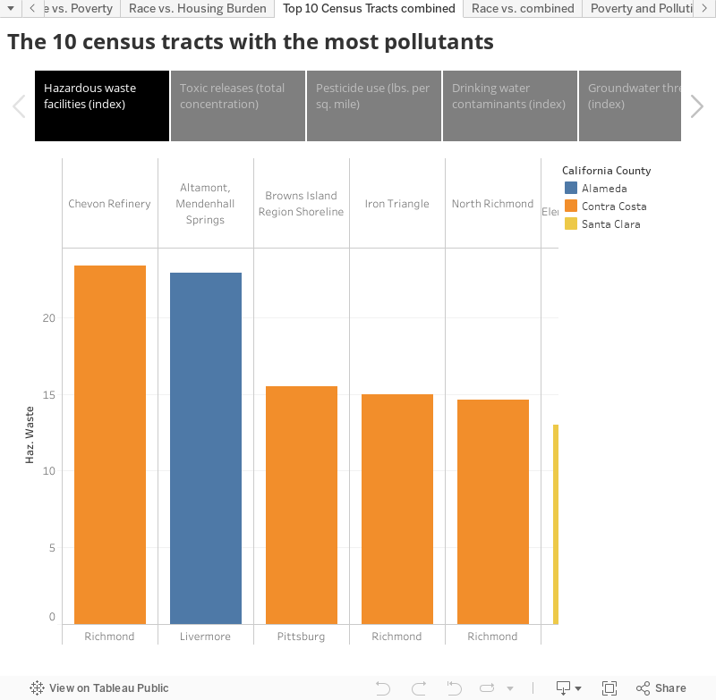
The following charts show the top ten census tracts with the most of a given pollutant. It also shows which city the census tract is located in and instead of showing the census tract, which is just a series of numbers, I've replaced the numbers with 1-3 distinguishing features about the census tract – businesses, factories, public parks, schools, etc. – in order to
give the reader more context.